Proxies are supposed to make the game easier to play—not harder to read.
If your “Underground Sea” looks like it was transmitted via carrier pigeon, you’re going to spend the whole night squinting, re-reading, and asking “wait, what does that do again?” That’s not high-power. That’s high-friction.
So let’s fix it.
This guide is about clean, readable, consistent proxy prints for casual play (Commander, Cube, kitchen table). It’s not about sanctioned events, and it’s definitely not about making anything pass as authentic. The goal is playable, not passable.
What “good proxy quality” actually means
High-quality proxy prints are not “photorealistic.” They’re functional.
A good proxy deck should have:
- Readable text at arm’s length
- Clean mana symbols you can recognize instantly
- Consistent sizing so nothing peeks weirdly in sleeves
- No white slivers on the edges
- Consistent look/feel across the deck (so you don’t accidentally create marked cards)
If your proxies meet those five requirements, you’re already doing better than most pods.
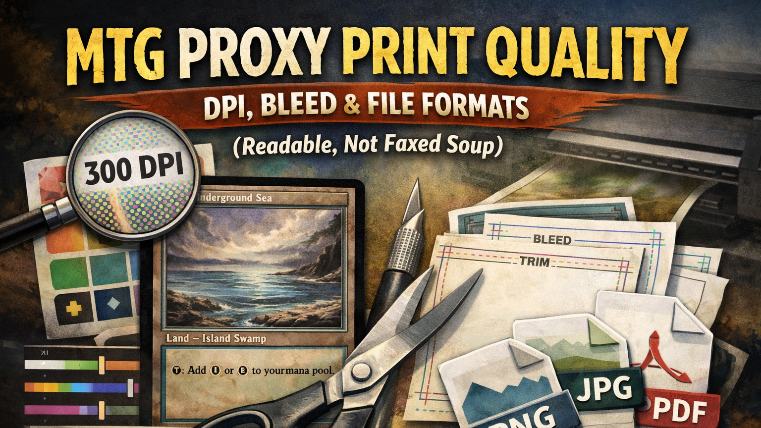
The proxy print spec sheet
If you only read one section, read this one.
Card size
A traditional Magic card is approximately 2.5″ × 3.5″. (In real life, “approximately” matters—printing tolerances are a thing.)
Resolution
- Minimum: 300 DPI
- Recommended: 300 DPI (yes, still)
- Nice-to-have: 600 DPI only if your art and text are truly high-res and your printer/service benefits from it
Bleed / Trim / Safe zone
You want three invisible boxes:
- Trim: the final cut line
- Bleed: background extends past trim so you don’t get white edges
- Safe zone: keep important stuff away from the edges so it doesn’t get clipped
A very common standard is:
- Bleed: 1/8″ (3mm) beyond trim
- Safe zone: 1/8″ (3mm) inside trim
Pixel dimensions cheat sheet (common poker/MTG-size templates)
For many card printers, a typical “poker-size” upload ends up around:
- ~822 × 1122 px at 300 DPI (includes bleed)
- Safe zone margin: about 36 px from each side (at 300 DPI)
Don’t stress if your service’s template is slightly different. The golden rule is:
Use the printer’s template/specs. If they give you a PSD/PNG guide, treat it like scripture.
DPI and pixels: the only math you need
DPI is dots per inch. Your file is made of pixels. The printer translates pixels into dots.
Here’s the entire conversion:
pixels = inches × DPI
So for a 2.5″ × 3.5″ card at 300 DPI:
- 2.5 × 300 = 750 px
- 3.5 × 300 = 1050 px
Now add bleed. If you add 1/8″ bleed on all sides, that’s 1/4″ total added to width and height:
- 2.5″ + 0.25″ = 2.75″
- 3.5″ + 0.25″ = 3.75″
At 300 DPI, that becomes:
- 2.75 × 300 = 825 px
- 3.75 × 300 = 1125 px
That’s why you’ll often see templates around ~822×1122 to ~825×1125 depending on the service’s exact “poker size” definition.
Two common mistakes
- “It’s 300 DPI” (but the image is only 400×560 pixels). That’s still low-res. DPI doesn’t magically invent pixels.
- Upscaling tiny art and hoping it becomes sharp. Upscaling can help a little, but it can’t restore detail that never existed.
Bleed, trim, and safe zone
This is the part that prevents the dreaded white edge and the even worse cropped mana symbol.
Think of a card design as three nested rectangles:
+----------------------------------+  ← BLEED (background goes here too)
|    +------------------------+    |  ← TRIM (final cut)
|    |  +------------------+  |    |  ← SAFE ZONE (text/icons stay here)
|    |  |                  |  |    |
|    |  +------------------+  |    |
|    +------------------------+    |
+----------------------------------+
The rules of the three boxes
- Bleed: Extend backgrounds/art all the way to the bleed edge.
(If the background stops at trim, you risk white slivers when the cut drifts.) - Safe zone: Keep text, mana cost, name line, power/toughness, and key rules text inside the safe zone.
- Borders: If you’re using a border, keep it comfortably inside the safe zone or it will look uneven when cut.
If you do nothing else, do this:
- Backgrounds go to bleed
- Important stuff stays inside safe zone
File formats: PNG vs JPG vs PDF
PNG (best for crisp text and icons)
Use PNG when:
- You have flat colors
- You need sharp edges
- You want clean text with no compression artifacts
JPG (fine, but don’t cheap out on quality)
Use JPG when:
- Your art is photographic
- File size matters
- You export at high quality (avoid aggressive compression)
JPG artifacts love to appear in:
- thin outlines
- small rules text
- mana symbols
- gradient skies (banding)
PDF (great when the printer wants it)
Use PDF when:
- The service asks for PDF uploads
- You’re printing sheets at home or locally
Two gotchas with PDF:
- Font handling: If you use live text, embed fonts or flatten to an image so nothing reflows.
- Scaling: Make sure it prints at 100% (no “fit to page” surprise).
Color mode
Many printers accept RGB or CMYK, but a lot of consumer upload systems are happiest with RGB/sRGB. If your printer gives specs, follow them exactly.
Color and contrast: why prints come out dark
The #1 proxy print disappointment is: “Why does this look like a muddy cave?”
Usually it’s one (or more) of these:
- Your screen is brighter than reality
- Your blacks are crushed (no detail in shadows)
- Your file uses a weird color profile
- The printer/service is optimizing for speed, not your masterpiece
Quick fixes that work embarrassingly well
- Raise midtones slightly (a tiny brightness bump beats a big contrast bump)
- Avoid near-black backgrounds behind small text
- Add subtle outlines/shadows to small white text on bright art
- Do a single-card test print before ordering a full cube
If you’re printing a whole deck, it’s worth doing one “proof run” first. Losing $8 on a test is cheaper than losing an entire Saturday of “why can’t I read this.”
Consistency and “marked cards” in sleeves
Even in casual play, you don’t want a deck where you can feel the proxied cards.
Here’s how proxy decks accidentally become marked:
- Different paper thicknesses across cards
- Different gloss levels (some cards slide differently)
- Home prints mixed with professional prints
- A few cards cut slightly off-size
Best practices:
- Sleeve everything (ideally same sleeves, same wear level)
- Keep one deck = one print method (don’t mix-and-match)
- Avoid “one-off” paper proxies in an otherwise uniform deck (unless you back them with a consistent filler card)
The 5-minute preflight checklist
Before you print or upload, do this:
- Canvas size: matches your printer’s template (includes bleed)
- Bleed: background extends past trim on all sides
- Safe zone: name, mana cost, rules text, P/T comfortably inside
- Legibility check: zoom to 100% and read it like it’s in play
- Compression check: mana symbols and text look clean (no fuzz/blocks)
- Consistency: same export settings across all cards
- Proxy clarity: make it obvious these are proxies/playtest cards (not authentic)
That last one matters socially and ethically. You want your cards to be playable—never confusing.
Troubleshooting: fast fixes
- Problem: White edges after cutting
Fix: Add bleed (background must extend past trim) - Problem: Text looks fuzzy
Fix: Export PNG (or higher-quality JPG), confirm true 300 DPI at the correct pixel dimensions, avoid upscaling tiny sources - Problem: Mana cost gets clipped
Fix: Move it deeper into the safe zone (don’t ride the edge) - Problem: Whole card is too dark
Fix: Lift midtones, reduce heavy contrast, avoid super-dark overlays behind text - Problem: Some cards “feel different” in sleeves
Fix: Don’t mix print methods/stocks; reprint the odd ones so the deck is uniform - Problem: Art looks pixelated
Fix: Start with higher-res art; if you must upscale, do it before layout and keep expectations realistic
FAQ
What DPI should I use for MTG proxies?
300 DPI is the practical standard. It’s the sweet spot for sharp text and reasonable file sizes.
What pixel size should I use?
Use your printer’s template. If you need a common starting point for poker/MTG-size prints, ~822×1122 px at 300 DPI (including bleed) is a widely used spec.
Do I need bleed if I’m cutting carefully?
Yes. Even perfect cutting has drift, and print shops have tolerances. Bleed is how you avoid white slivers.
PNG or JPG?
If you care about crisp text: PNG. If file size matters and you export high quality: JPG is fine.
RGB or CMYK?
Follow the printer’s specs. If they don’t specify, RGB/sRGB is usually safest for consumer upload systems.
Are these proxies tournament legal?
No. This is for casual, unsanctioned play where the table/store allows it. For sanctioned play, use authentic cards.