AI art is one of the fastest ways to turn a proxy deck from “functional” into something that actually feels like your deck. It lets you build a visual theme, match a commander’s vibe, create alternate versions of iconic cards, and keep a whole list looking consistent without hunting through a hundred unrelated images.
The trick is using AI as a design tool, not as a slot machine.
If you just type “dragon wizard magic card art,” you will usually get something flashy but unusable. Great proxy art comes from giving the model a clear job: who or what is in the scene, what mood the card should have, what composition works for a card frame, and what details should stay out of the image so the final card still reads cleanly when printed.
Start with the card’s job, not the card’s rules text
Before you write a prompt, decide what the card is supposed to feel like.
Ask yourself what the card is doing visually:
- Is it removal
- Is it ramp
- Is it a board wipe
- Is it a commander build-around
- Is it a huge finisher
- Is it a subtle utility piece
That matters because good proxy art is not just “pretty.” It should help the card feel right when somebody sees it across the table.
A wrath effect usually wants scale, impact, motion, collapse, fire, divine judgment, darkness, or magical destruction. A value engine might want something quieter and more iconic. A tutor spell may want mystery, searching, libraries, maps, stars, ritual circles, or a character discovering forbidden knowledge. A counterspell often works best when the image captures interruption, denial, shielding, distortion, or time freezing.
If you start from the card’s role, your prompts get much better fast.
Pick a visual lane for the whole deck
This is where AI really shines.
Instead of generating each card one at a time with random aesthetics, pick one direction for the deck:
- dark gothic fantasy
- painterly high fantasy
- anime-inspired elemental magic
- stained glass divine imagery
- eldritch cosmic horror
- whimsical storybook fantasy
- retro pulp fantasy
- art nouveau enchantment style
Once you pick a lane, keep reusing the same style language. That is how you get a deck that feels curated instead of chaotic.
For example, if you are making a mono-black deck, you might decide that every card should look like “ornate gothic fantasy oil painting, moonlit, dramatic shadows, silver filigree motifs, cathedral atmosphere, vertical composition.” Repeating that style DNA across your prompts creates visual consistency, which matters a lot more than people think once the cards are sleeved and shuffled together.
Use a prompt structure that actually works
A simple prompt formula works better than trying to write a novel:
subject + action + environment + mood + composition + style + print-safe constraints
For example:
ancient dragon emerging from volcanic ruins, lava cracking beneath its claws, dramatic cinematic lighting, high fantasy oil painting, vertical trading card composition, clear focal point, detailed but readable background
That is already much stronger than something vague like “cool dragon magic card art.”
The best prompts for proxy cards usually include:
- one clear main subject
- one clear action or visual moment
- a defined setting
- a mood
- a vertical composition
- instructions that keep the art readable inside a card frame
Good phrases to include:
- vertical fantasy illustration
- trading card composition
- clear focal point
- centered or upper-third subject
- readable silhouette
- dramatic lighting
- detailed foreground, softer background
Good phrases to avoid or limit:
- too many characters
- crowded battlefield
- tiny face far away
- highly symmetrical flat wallpaper look
- text in image
- border
- frame
- logo
- watermark
That last group matters because modern image models are good at many things, but extra fake text, fake symbols, and clutter can still make final art worse. OpenAI’s image models are built for strong prompt following and text rendering, while Stability’s image models emphasize prompt control and customization, which is useful when you want a more repeatable art workflow.
Generate in batches, then curate hard
One of the biggest mistakes people make is keeping the first image that looks “pretty good.”
Instead, generate several versions of the same idea. Then compare them based on actual card-use questions:
- Does the focal point survive being cropped into a card frame
- Does the art still read at small size
- Is there room for text boxes and frame overlays
- Does the mood fit the card
- Does it match the rest of the deck
Usually, the best proxy image is not the wildest one. It is the one that still looks strong after the frame, title bar, mana cost, type line, and text box all take away visual space.
This is why “vertical composition” matters so much. Scryfall’s card image system itself distinguishes between full card images and crops like art_crop, which is a good reminder that card art has to survive framing and cropping well.
Use reference cards for direction, not for copying
A smart workflow is to look at the original card and ask what emotional beat it is trying to hit.
Maybe the original art says:
- holy protection
- explosive speed
- necromantic decay
- serene forest growth
- cosmic inevitability
Then you build a new prompt that captures that same feeling in your own lane.
That approach gives you better custom art than trying to recreate the official image too closely. It also helps your proxies feel like alternate interpretations instead of knockoffs.
Scryfall is especially useful here because it gives reliable card data and image references, including image URIs and art crops, so you can quickly study composition, palette, and focal placement before writing a new prompt.
Keep your proxies clearly custom
The best-looking proxies are not the ones that try hardest to pass as real. They are the ones that look premium, readable, and intentionally custom.
That means you generally want to avoid generating fake set symbols, copyright lines, holo stamps, artist signatures that imply authenticity, or anything that pushes the card toward counterfeiting. A better goal is “beautiful custom game piece” rather than “convincing fake original.”
That approach is also the safer creative lane. Wizards’ Fan Content Policy requires fan content to be unofficial and to respect other people’s IP, and Wizards has separately said it does not want generative AI used for final Magic products created for the game itself.
Best types of cards to make with AI art
AI-generated artwork tends to work especially well for:
- commanders
- staples you see often
- tokens
- lands
- showcase builds
- themed cubes
- decks with a strong aesthetic identity
Lands are especially good because the art can do a lot of emotional work even when the card function is simple. Tokens are great because you can push style harder. Commanders are maybe the best use case of all, since they anchor the whole look of the deck.
A practical workflow you can repeat
Here is the clean workflow:
Pick the card.
Decide the card’s emotional role.
Pick the deck’s style lane.
Write one prompt with a strong focal point and vertical composition.
Generate multiple versions.
Choose the version that crops best and reads best.
Repeat with similar style language across the deck.
Then drop the art into your proxy template and proof the final card at actual card size.
The proof step matters. Art that looks incredible full-screen can look muddy once printed on a real card. Always test readability in the actual frame.
Example prompts
Here are a few examples of the kind of prompts that usually work well:
Board wipe
divine cataclysm tearing across a golden city, radiant shockwave, terrified silhouettes, epic fantasy painting, vertical trading card composition, dramatic lighting, strong focal point, readable scene, no text no logo
Counterspell
arcane mage freezing an incoming spell in midair, shards of blue light and broken runes, dark stormy background, high detail fantasy illustration, vertical composition, centered subject, crisp silhouette, no text no border
Ramp spell
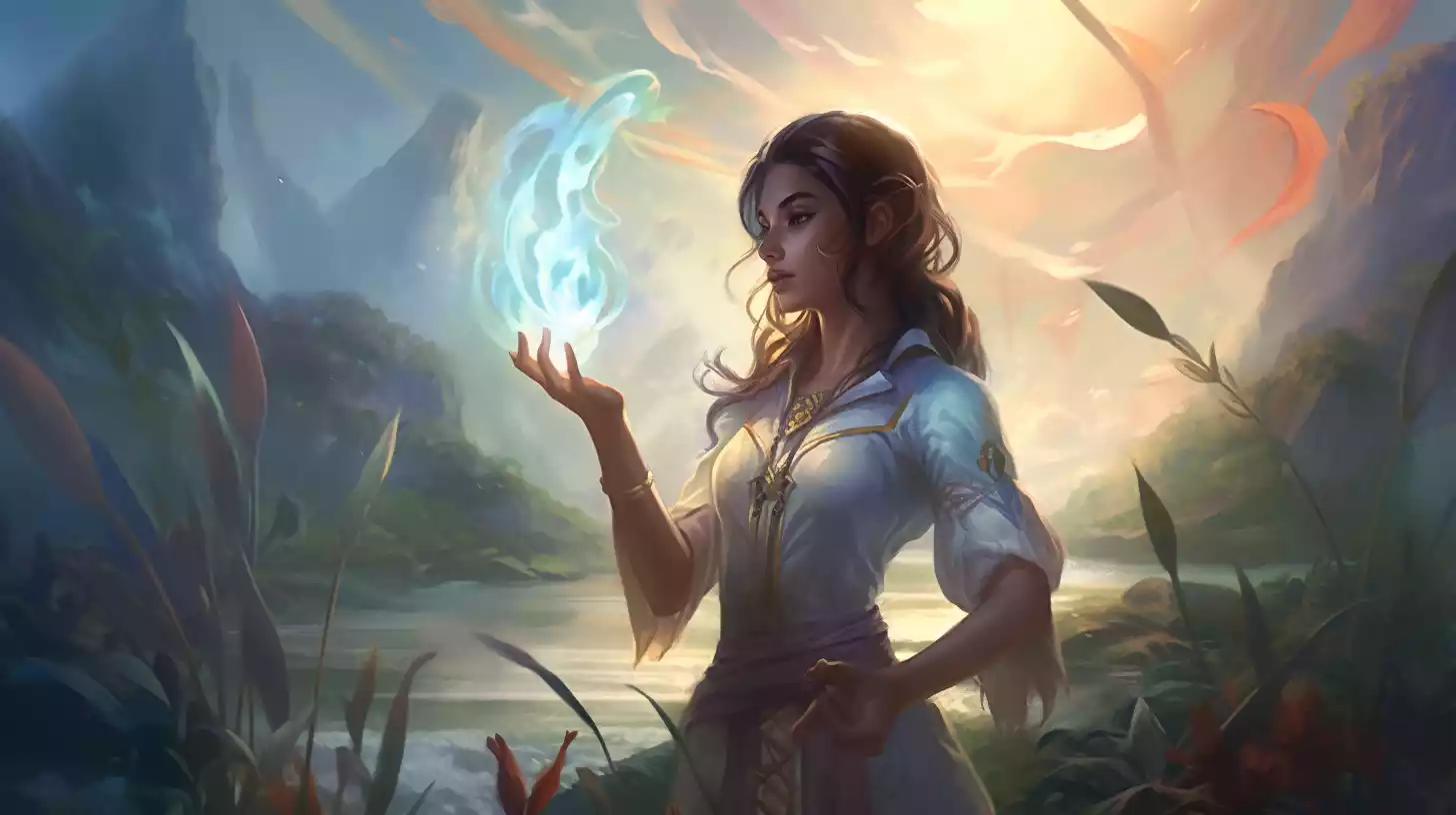
ancient forest erupting with glowing life energy, roots and vines spiraling upward around a druid, luminous green atmosphere, painterly fantasy art, vertical card art composition, clear focal point, soft background detail
Commander
regal vampire queen seated on a moonlit obsidian throne, silver armor, flowing crimson cloak, gothic cathedral shadows, ornate dark fantasy oil painting, vertical composition, strong central silhouette, elegant dramatic lighting
Final thought
AI works best for MTG proxy artwork when you treat it like an art director’s assistant.
Give it a clear assignment. Keep your deck in one visual lane. Generate several options. Pick for readability, not just spectacle. And make the final cards feel intentionally custom.
That is how you go from random AI images to a proxy deck that actually looks cohesive, playable, and worth printing.